IBKA is a Toronto-based visual consultancy that caters to fashion, beauty and lifestyle brands. Founder, Ibukun (aka Ibk) had started building a reputation for herself as a photographer. As her brand began to take off, she realized she needed to craft her brand identity. She also realised that she wanted to bring much more to the table than just photography. This realization was fueled by two goals. First, to empower women of color running businesses. Second, to connect creatives.
After a consultation session, we agreed that it would be best to position her brand as a firm and not as a freelancer. The goal was to appeal to a higher end clientele and present the brand as a premium service provider.
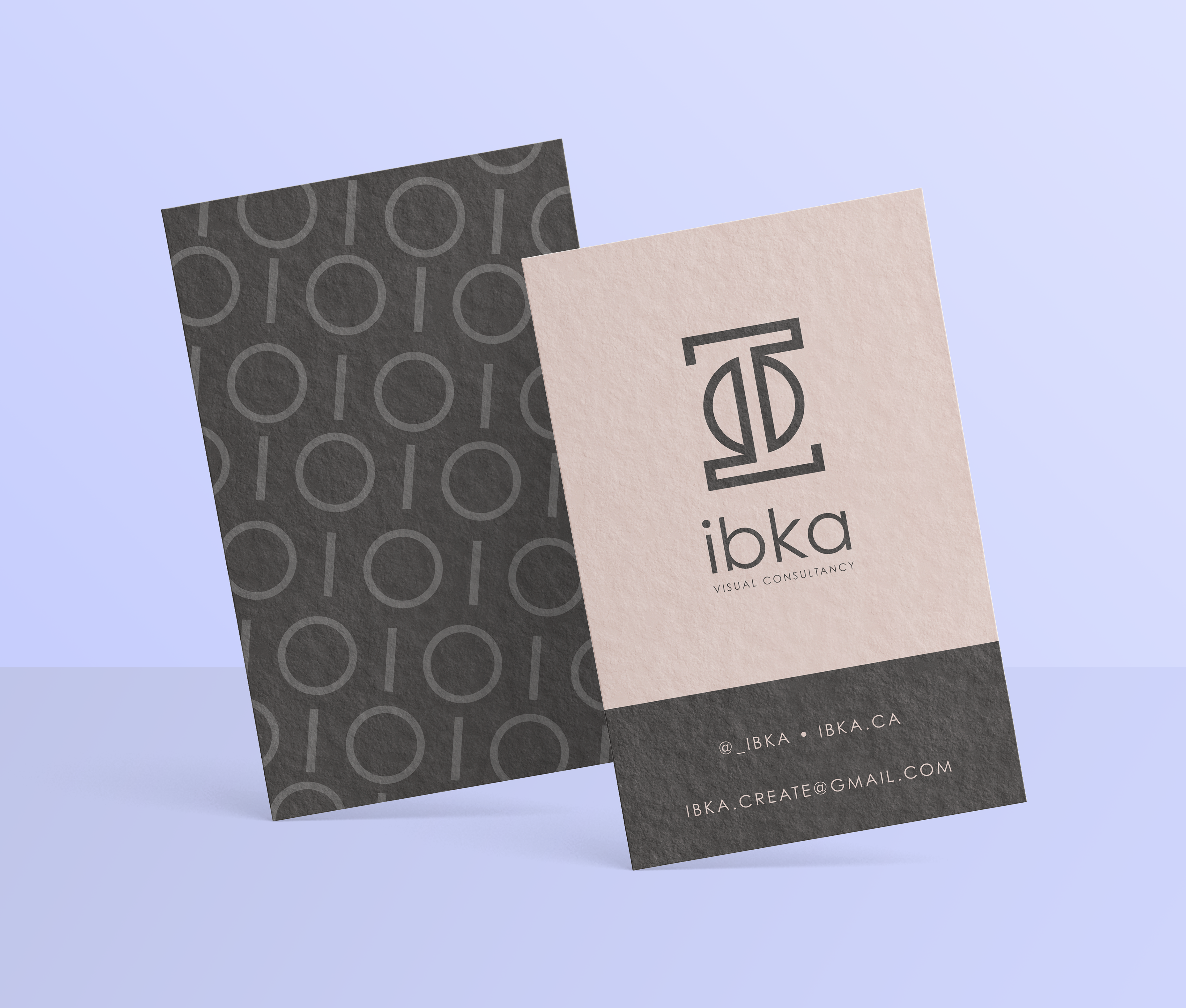
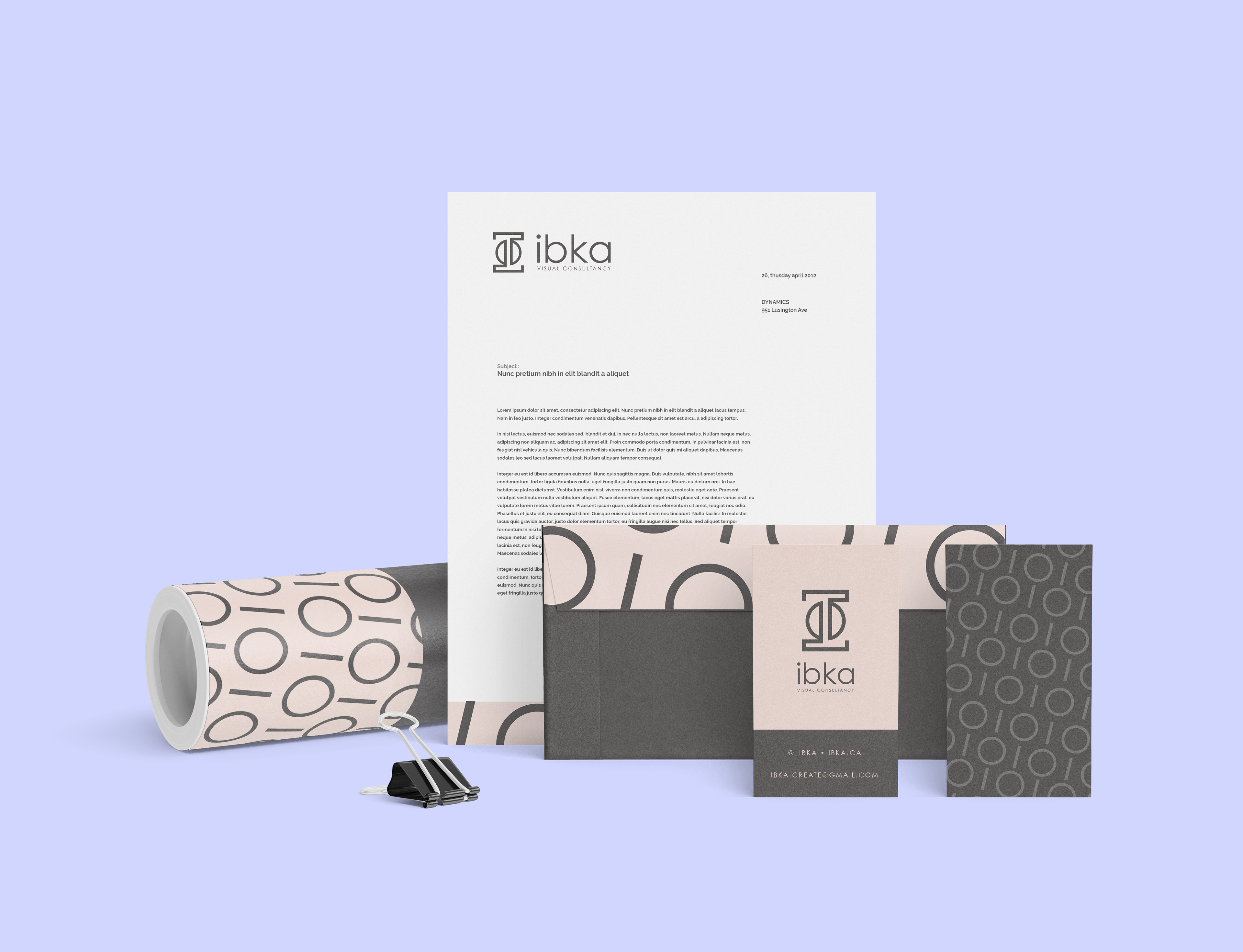
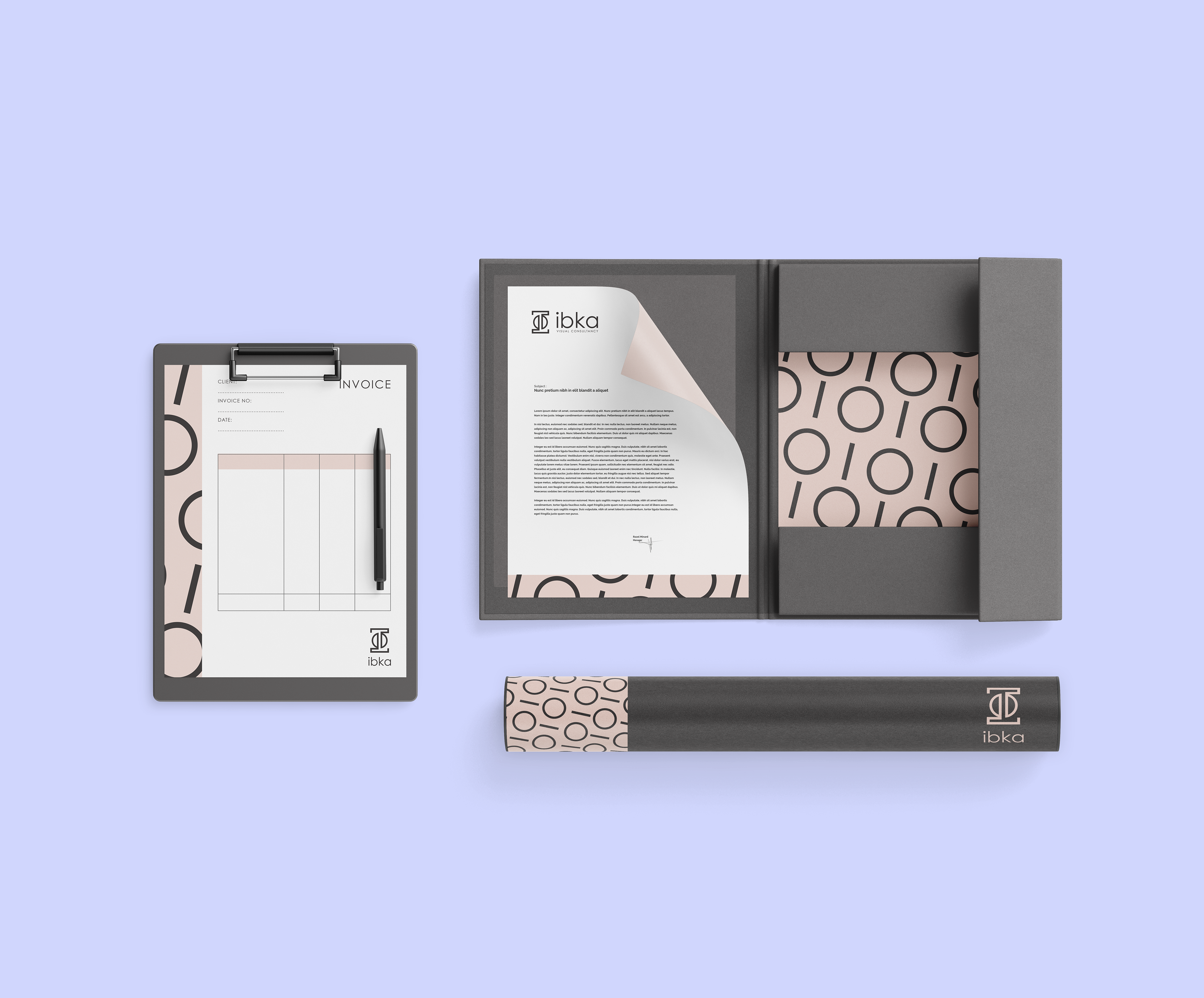
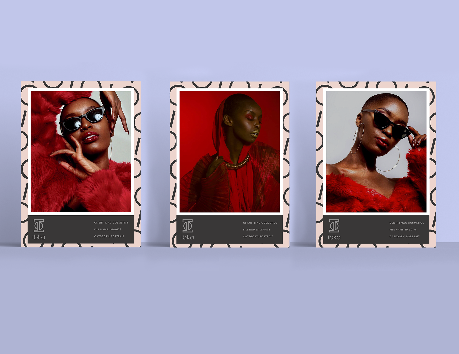
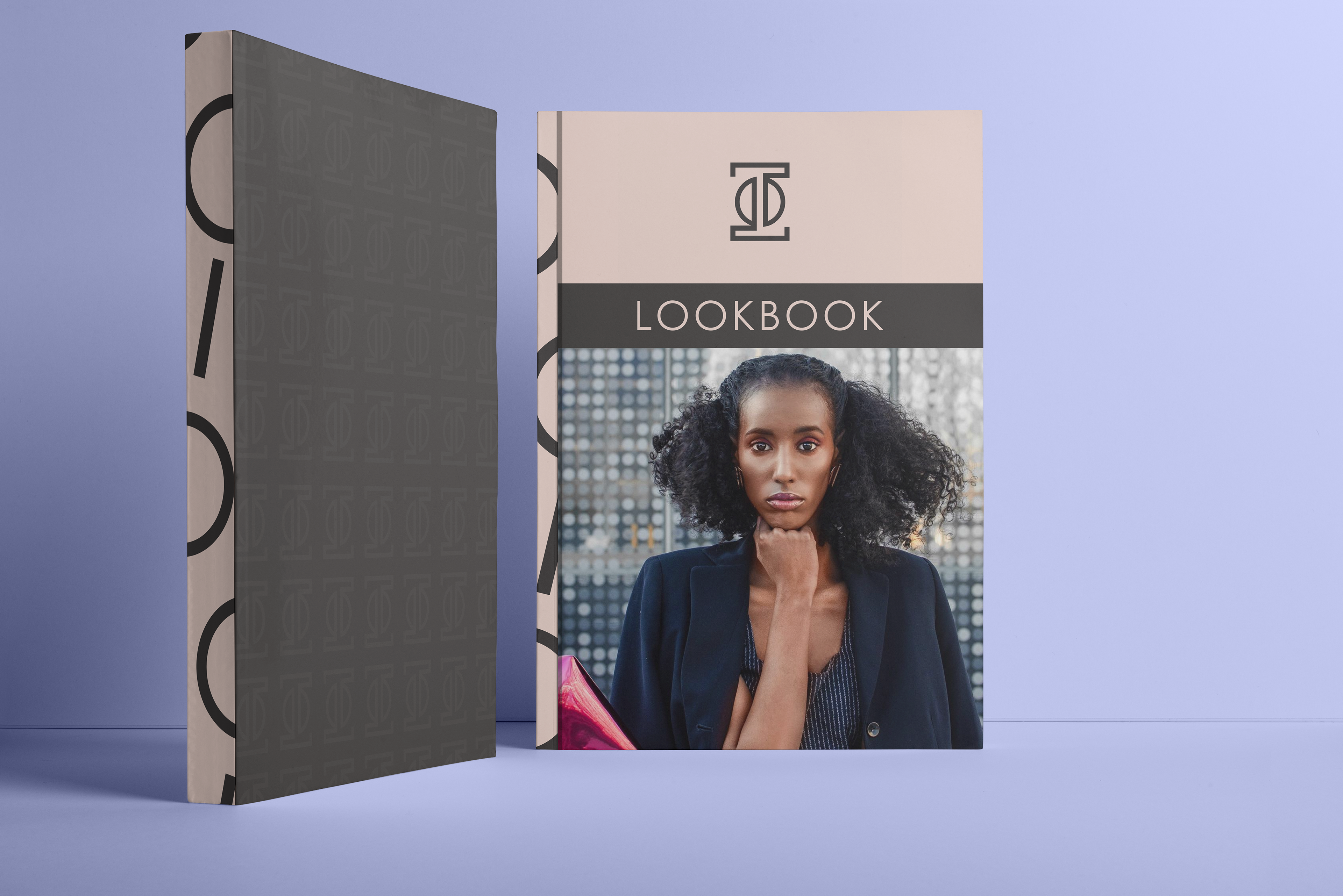
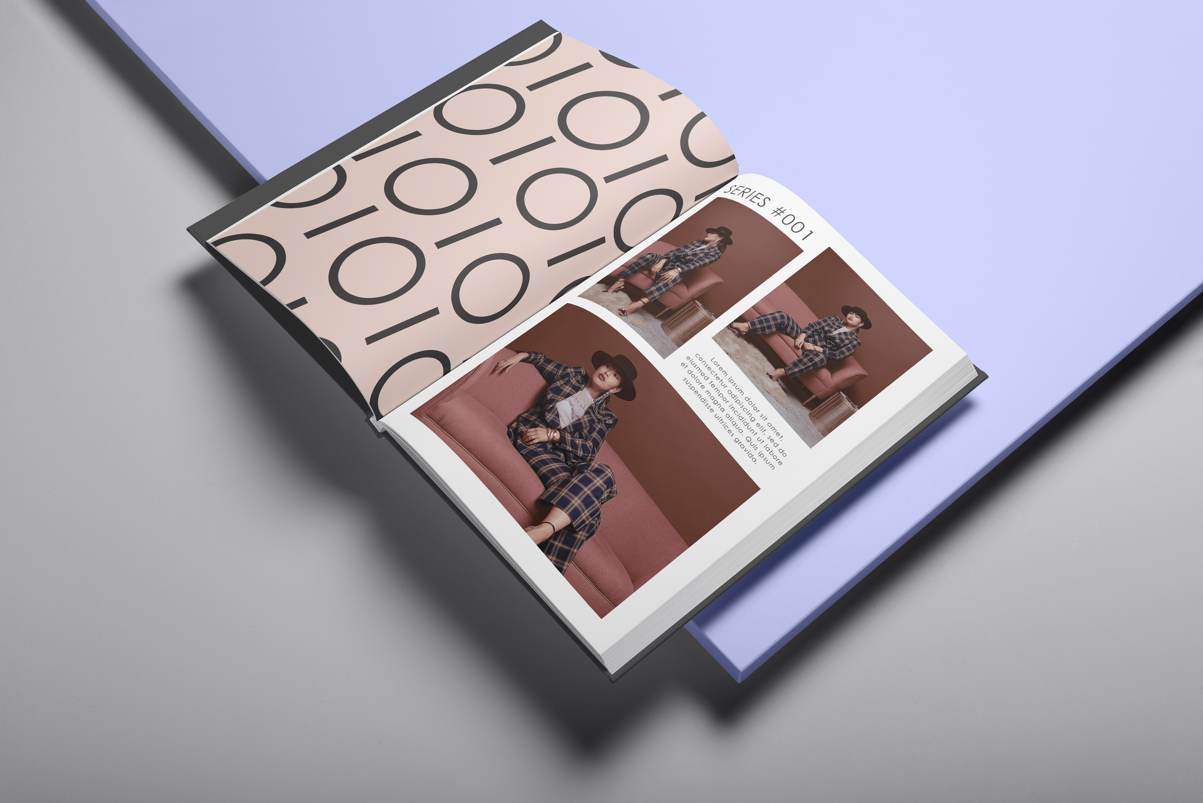
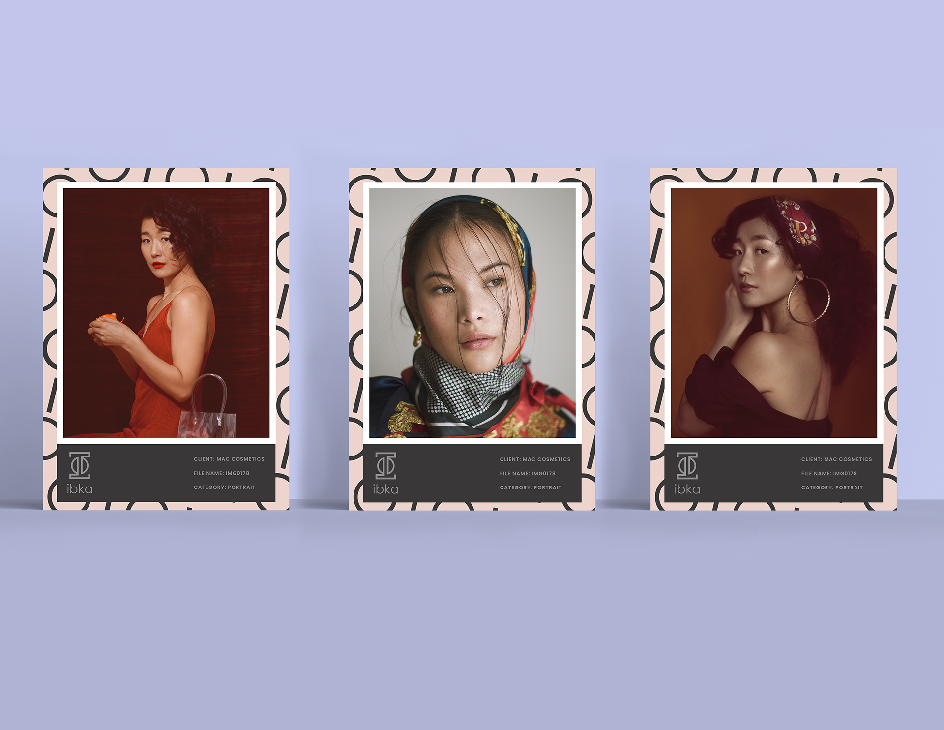
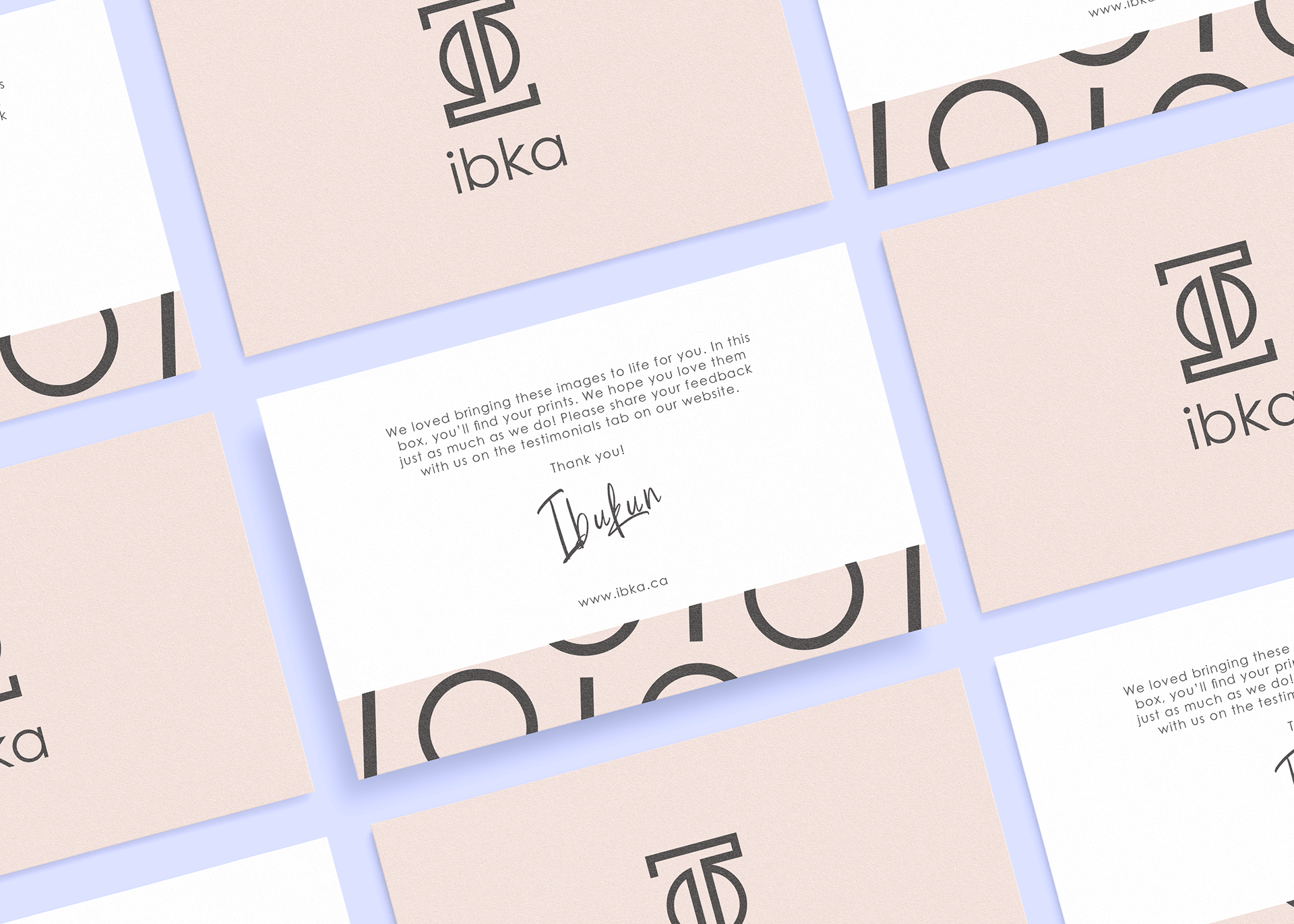
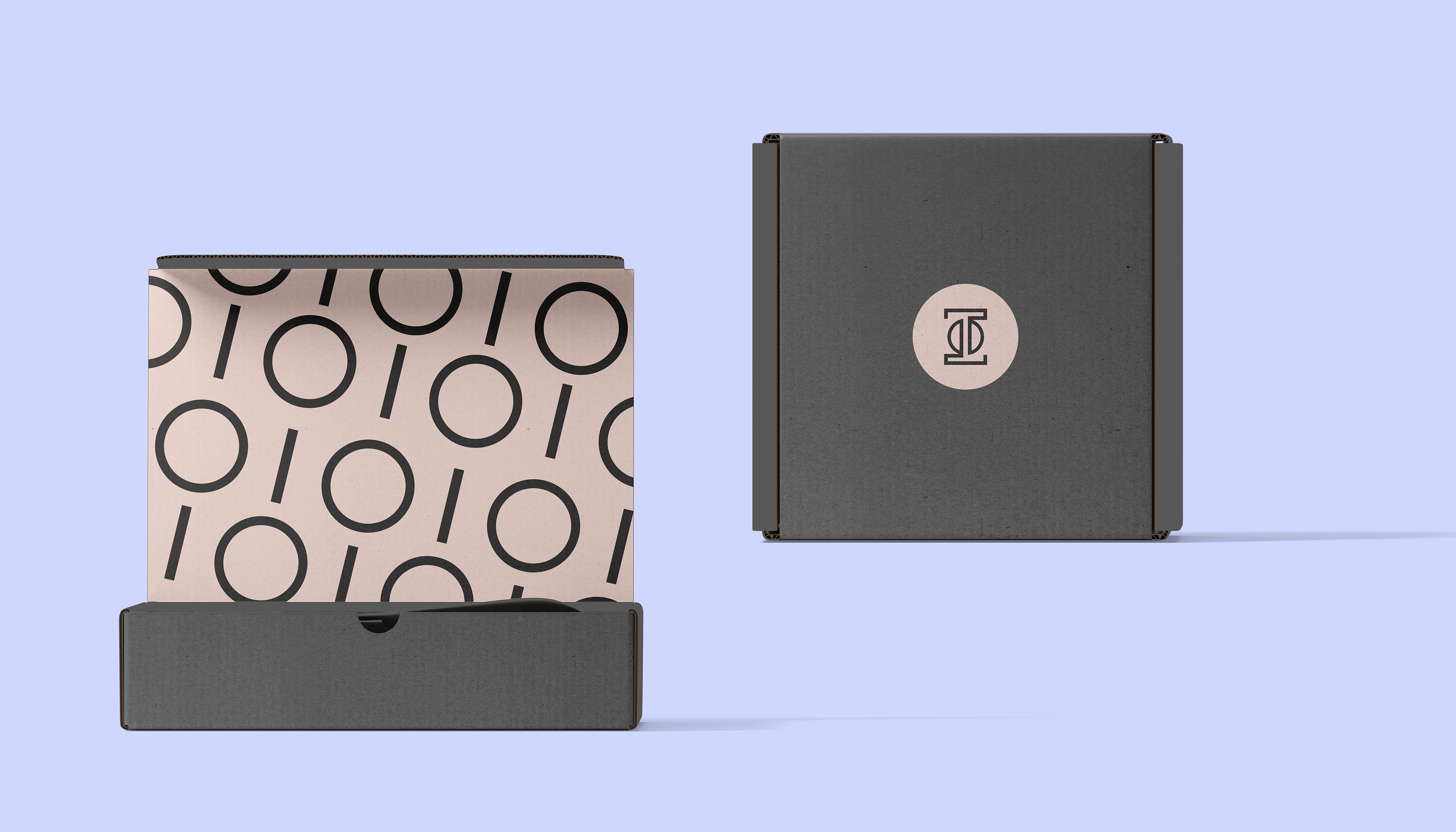
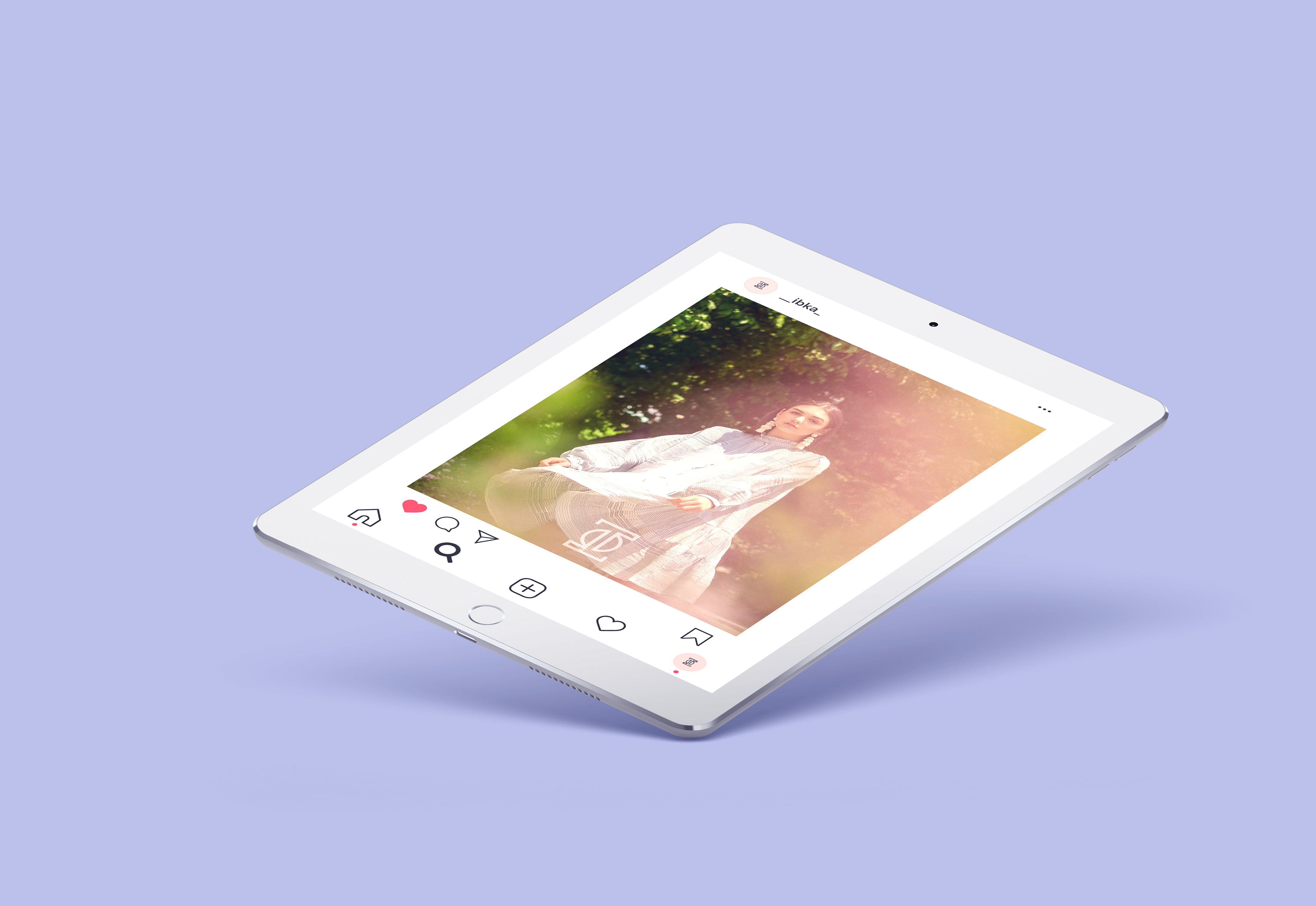
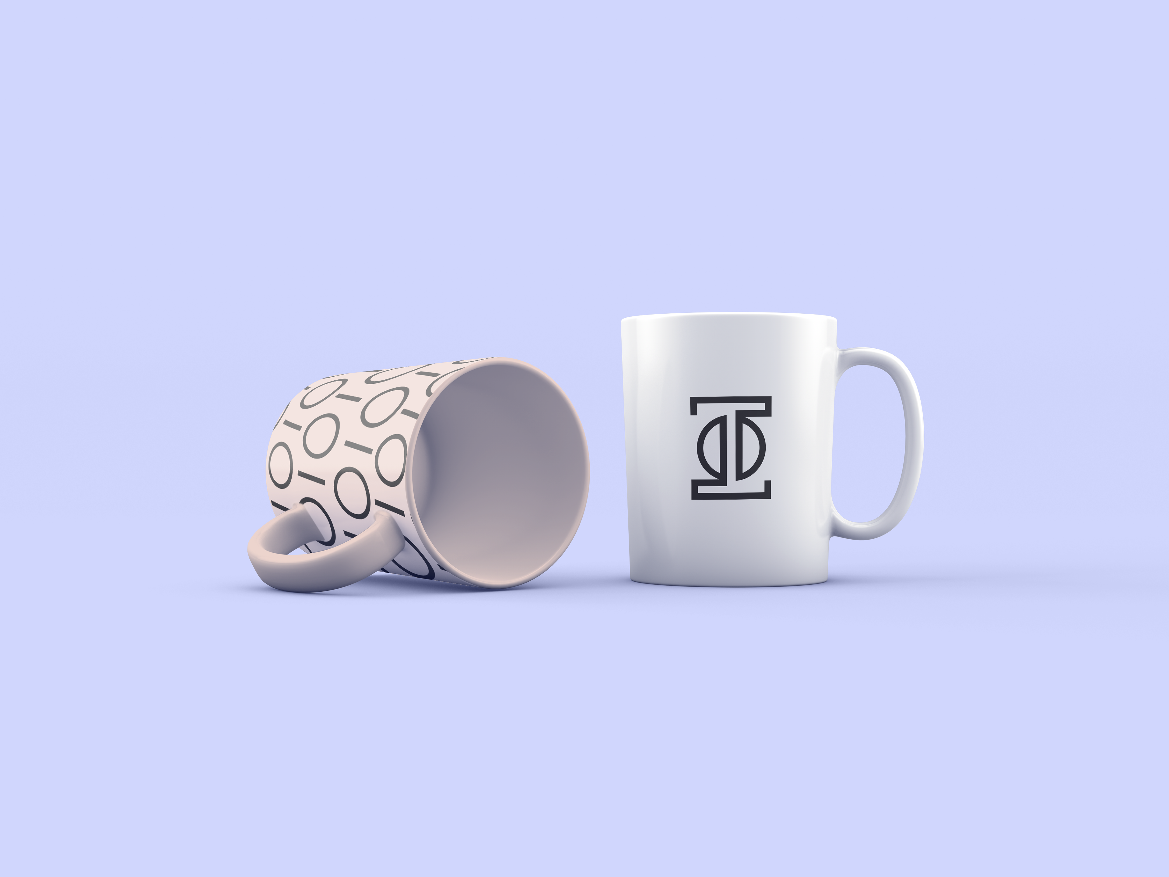
In fulfilling the brief, I was inspired by the concept of balance. At core, IBKA's goals (empowering WOC business owners + connecting creatives) are aimed at creating balance. The concept is visualized in the brand identity system through the symmetrical "I" icon, the geometric sans serif wordmark, and the repeat brand pattern.
CREDITS
PORTRAITS CAPTURED BY IBUKUN ADELEYE @__IBKA_
MUG MOCKUP TEMPLATE PSD CREATED BY ALEKSANDR_SAMOCHERNYI ON FREEPIK
ALL OTHER MOCKUPS SOURCED THROUGH DESIGN CUTS (LICENSES PURCHASED)
DISCLAIMER: I do not own the rights to any of the portrait photographs presented in these mockups. The photographs have been used with the permission of the client (IBKA) who photographed all the images presented.